Showing posts with label Melissa Rohrer. Show all posts

Wednesday, August 29, 2018

Seeking salvation on the bluebird of happiness

This is my piece for the Poetry in Art 2018 exhibit at Riverside Artists Gallery based on the poem, "An Invitation to My Sister" by Athens, Ohio poet Jean Mikhail. 
Poets submitted poems for the event and artists created works inspired by the writing. 
Poetry in Art will continue through Sept. 29.  The gallery is open 10-5 Tues. through Sat.
To make this piece I formed the bird on the wheel, just like any pot, with the beak being the top of the form.  I left a little extra clay at the bottom so that I could pull (yes!) the tail- a lot like the traditional way of making handles for a mug. The figure was then hand-formed and attached, and a little carving done here an there to define some details.  I hoped to use colored slips for the entire piece but found I did not quite achieve the colors I wanted so parts are painted with acrylic paint- mostly the figure. It was finished with a protective  spray varnish after mounting on the wooden base. This piece sold at the August 25 opening. 

Below is an excerpt from Jean's poem.  The full poem is on display in the gallery. 

A big part of the show is seeing the artists' responses to the poems. This is very personal, of course, and may be tied in with their own experiences.  So it is all the more fascinating to hear what the poets have to say about their own poems.  They had the opportunity to do this during a reading of the poems on the opening evening (Aug. 25) of the exhibit.

Below is another version I made- because working with ceramics you never know what can happen.  Always good to have a back-up plan.  This one is going to the WOAP exhibits, curated by Kari Gunter-Seymour.


Also going to the WOAP exhibits is another piece that was inspired by a poem, this one by Lisa M. Pursely.  Her poem, "Where Catfish Bloom", was submitted to Poetry in Art in 2016.  It was not chosen by an artist for that exhibit, but is one of those poems that stayed with me.  I could name several more.
It does happen that some great poems are not chosen by artists to work with simply because the artist cannot envision what direction the poem will take him/her when it is first submitted. 


Wednesday, December 13, 2017

Toad houses...with toads


I made two toad houses for a customer who wanted to give them as gifts. I was instructed to make each one a little different from the other, and with toads on top of both. I made large toads perching on the sides of the roof rather than try to make tiny ones to fit on the very top.  Getting the details of the feet and legs seemed like it might be too difficult in miniature.  By the way, the toads bodies are hollow and after attaching to the roofs I made a hole through the roof and the toad bellies so as to avoid any unfortunate toad explosions.
                                                            
The houses were made on the wheel as closed forms.  When leather hard, I placed them back on the wheel and threw the little finials, one an acorn, and the other a beehive (sort of) on top.  
The color application came after bisque firing.  I have some engobes and slips that can be used on both greenware and bisque, but find I prefer to use them on bisque since, being dry and porous, it holds the material better.  Also, I often apply the color then wipe off to leave a light stain in some areas and darker stain in areas with etched designs- a technique which works best with bisque fired pieces.  Next, the toad houses were glazed, then a 50/50 by weight combination of frit 3134 and mason stains was brushed over the glaze to get the toad color.  A little disappointment here- what worked great on a test tile (chartreuse spots over tan) did not work as well on the toads, as the chartreuse can barely be seen.  Actually, at least around here, toads are not green, but the customer asked if I could add touch of green.  I am very glad that this particular customer understands that working with glazes is not the same as choosing crayons out of a box!
One of those grab and go mornings with the items, still warm from the kiln: Quick pictures of the finished toad houses with an oak tree for a backdrop at River City Farmer's Market in Marietta, Ohio just before meeting up with the customer.


Monday, October 2, 2017

Where Catfish Bloom

In the last post I showed the greenware version of this piece. It progressed to bisque fired and now to glaze fired. This project was inspired by the poem by Lisa M. Pursley, "Where Catfish Bloom", which I am sharing with Lisa's permission.


Where Catfish Bloom
Yesterday she was daisies,
dahlias and a spray of baby’s breath
until she was trapped
by the frailties of a civil engagement;
an iron woman achieving honesty,
sanity and swept floors.
She shares a confident understanding
of individual smallness.
All her lovely habits fortified,
trampled like the spirit
of a goddess in the rain.
Now she sits, cut
and stuffed, in a clearly gripping vase.

Lisa's poem was one of many submitted to Riverside Artists Gallery's 2016 Poetry in Art and was one among some great poems that were not chosen by any of the participating artists.
It was in my short list of poems I was considering for myself, but at the time I could not seem to solidify my thoughts on how I would approach the project.
I am no longer with the gallery but at that time I had been coordinator of the 2016 Poetry in Art exhibit and had a file of poems that were submitted by poets for consideration by the artists. When cleaning out files this spring "Where Catfish Bloom" was one of several from that exhibit I kept. 
It was very difficult to delete any on them!  
Above:  As you can see the piece stands on a flat surface, but is also wired for wall hanging.
Below:  Some decision making about whether to leave it alone or keep going.  This is the bisque fired head. I thought about leaving the head just like this.  The color of the bisque fired clay is very much like flesh tone and I had burnished the clay a bit so it has a smoother appearance than usual.  The glaze I used on the box is rather rustic so I decided to go ahead and fire the head to cone 6 (my usual glaze firing) in order to get the tan color this clay obtains when fired to maturity.


Below:  I decided to add a little iron oxide to the hair and darken the irises with a combination wash of cobalt ox. and copper carb.  Later, I brushed a little clear glaze on the irises (not shown).  The bisque fired head is among some pots awaiting a cone 6 glaze firing.


Friday, August 25, 2017

box in a box

A new project underway which may be submitted for an exhibit if it works out.  I never like to say it's a sure thing until I open the kiln after the final firing.

The head is decorated, somewhat minimally, with colored slips and engobes.  Not sure yet if I will be glazing this.
 The main part of the project, building the box, especially with the extra step of a recessed inner box, requires a fair amount of planning.  I used templates.  In measuring, you must allow for the thickness of the clay which is 1/4 inch thick.  So for a six inch square box, two of the outer sides are 6 inches and two are 5 and 1/2 inches. Sides are butted together on top of the square slab. Making sure the sides are at a 90 degree angle to the slab which is the front of the box is just as important as all the measuring.  If I continue to use this shape I might build frame or two right angles out of wood to use as a guide.  As it was, I used a couple of small scrap boards to press the sides against.  This seemed to work pretty well in squaring up a couple of wonky areas.  Same process used for the recessed box, only those sides are a quarter inch narrower than the ones on outside of box in order to accommodate the small slab which backs it.  Then the box is flipped over and the small square is cut from the front to form the inset.  Of course all the pieces were slipped and scored throughout  assembling and I followed up with working narrow coils into the seams.
You can see in above picture that I also added a couple of blocks to thread a wire through for hanging.  Unless some warping occurs in the firing this piece has the option of standing on its own.

All the pieces were a stiff leather hard before building.  It is very important to have the separate slab cut-outs dried as close as possible to the same moisture content.
Right now I have the box slowly drying.  Then bisque fire, glaze, glaze fire and cross fingers!


Monday, July 31, 2017

clay and found object sculptures and some toad houses!

She's come undone-
A clay/found object sculpture which is partially the result of a kiln accident.  Though the head had been destined for a similar project, the theme somewhat changed when the back of the head blew out in the firing.  I admit to rushing the process due to a hurry-up on a mug commission and wanting to get the head in the same firing.  Some moisture must have been trapped despite the candling time I programmed into the kiln.  Or perhaps her mishap occurred as she was facing the other character in the kiln-

Click to enlarge.
"Tweetily Dee" came about this way: Having seen pictures online of hats made of felted cat fur, and since Red the cat sheds copious amounts of that substance, I decided to give him a good combing and try my hand at cat fur felting.  I placed a mass of fur in an old shirt sleeve, tied the ends of the rag, poured boiling water over it, then tossed it in the dryer.  It turned out looking like a small toupee. See below.  So, the next thought was to make a clay head- one whose hair seemed to resemble Red the cat's, and glue the toupee on after the head was fired.  As I formed the head it seemed it wanted to be too big for the toupee so I gave up on the cat fur gluing idea.  And, I doubted anybody would care to have my cat's fur in their home.  I don't want my cat's fur in my home.  But he does have a great personality.


Scavenged political sign frames were used for the arms in "Tweetily Dee". 
Quotes from tweets were taken from ones which were sent out since taking office.  Seven coats of polyurethane over the tweets!
Acrylic paint used on both "She's come undone" and  "Tweetily Dee".

Motivation for these projects came from Riverside Artists Gallery's upcoming Found Object exhibit opening Friday, Aug 4 during First Friday in Marietta.

Red, the cat.  A source of inspiration.
                                                                   

A plein air event at The Castle in Marietta, Ohio. I threw 3 toad houses on the wheel a couple of days in advance.  During the event I added decorative elements, some of which were taken from The Castle's architectural details.
Other artists present were Ginny Killian, Lynda Rhodes, Karol Goldstein and Alan Norris.
The day started out chilly with a little drizzle which didn't bother me but challenged the painters at times. Pictures are thanks to Janet Chase.

This is one of the toad houses.  Another one has an owl on top and a third has a squirrel.
Will be using some engobes and washes on these after the bisque firing.


Friday, June 23, 2017

mini churn making

An interesting project has come my way.  I have been working with a local historical group to reproduce small versions of a pottery item.  The original was made by a potter who once worked on the property known as "The Castle" in Marietta, Ohio.

I will more or less quote the information from The Castle Facebook page:  The items I reproduced were butter churns.  One, approximately 11 inches high, is about a half size version of a churn made by Nathaniel Clark at The Castle location in the early 19th century. The original churn was stamped by Clark with his name and the Marietta location. The downsized copy re-creates the shape and incised decorative banding of the original, and is marked on the base as a one-of-a-kind reproduction authorized by The Castle Museum.  This one was available for purchase by raffle at a special garden party fundraiser at The Castle this week.

Then there are the really down-sized versions:  The mini churns which are sold in The Castle's gift shop.  So far, I have completed 56 of these small churns which are only 5&1/2 inches tall- about 5 inches after firing.


The mini butter churns are a very narrow- approximately 2&1/4 inches wide at top and bottom.  For part of the making process I am using the old sponge on a stick method (above) in order to get to where my fingers cannot!


The 11 inch churn surrounded by some of the mini churns.  
It took some experimenting to find the best possible way to reproduce the look of the clay and, since I am using an electric kiln, the lightly salted wood fired surface on the original.

All is not work!  Ivin and I had a nice visit with some friends at the beach last week.


Friday, April 28, 2017

the secret life of potters

This week:
Obsessing over making an oxidation fired plate coordinate with a reduction fired plate.

Obsessing over making mini butter churns fired in oxidation that correctly replicate the 23" tall salt fired original in both proportion and glaze.  I may be explaining this more at a later date.

Major obsessing about getting this mug commission right. 
Size, color...yes, but mostly fear of glaze failure during the last firing for the decals.  Having had a few problems with pinholing in the past, I did a search and found that better kiln ventilation may solve the problem- leaving the lid and portholes open up to 500 degrees F.  That, and spacing the mugs about 2 inches apart in the kiln.  Success! At least this time.  And, hurry up to get some birds and cairn parts in the kiln to be bisque fired along with the decal firing.  Luckily, the sun was out to help the drying along.

15 emails and several picture taking sessions about a possible commission through etsy. It is possible I gave the customer too many choices.  Some of the test tiles involved:

And, these are a few of the closed forms in the glaze firing this week.  Made these just because I wanted to and am trying to learn what I can do glaze-wise with this spotted clay.  Will have these at River City Farmer's Market tomorrow.

Picture taking session is not over until I can focus on the interactions of a wood ash glaze and several other glazes used on this pot.  Yes, this is what we obsess over.


Friday, March 17, 2017

Empty Bowls 2017 and some honey jars

Empty Bowls is coming up soon.  Here's a few of the bowls I will bring to the event, scheduled for
Saturday, April 1 at 11 AM - 1 PM at  
First Presbyterian Church, Marietta, Ohio
501 4th St, Marietta, Ohio

 The above bowls are more of a cup-of-soup size while the handled bowls below are larger and come with cracker plates.

 I had to show a closer look of this glaze combo. This is a Tenmoku Gold with Blue Hare's Fur over it on the inside of bowl.  I don't know if this is going to be a consistent result or if I just got lucky.  First try was with just the tenmoku but I got too much gold, not enough dark contrast.  I re-glazed over the inside with the Blue Hare's Fur and fired again. Click on the pic for a closer view.

 The rims on this set have slightly different designs carved into them.  This is an off white glaze, and difficult to see, but there is a touch of green glaze just on the rims. The spots are from the clay, not the glaze.  I'm on the fence about this clay.  Thinking of seeing if the supplier will mix it 50/50 with a non-spotted clay. It depends what you're going for, I guess.  I would say it's a rustic look.

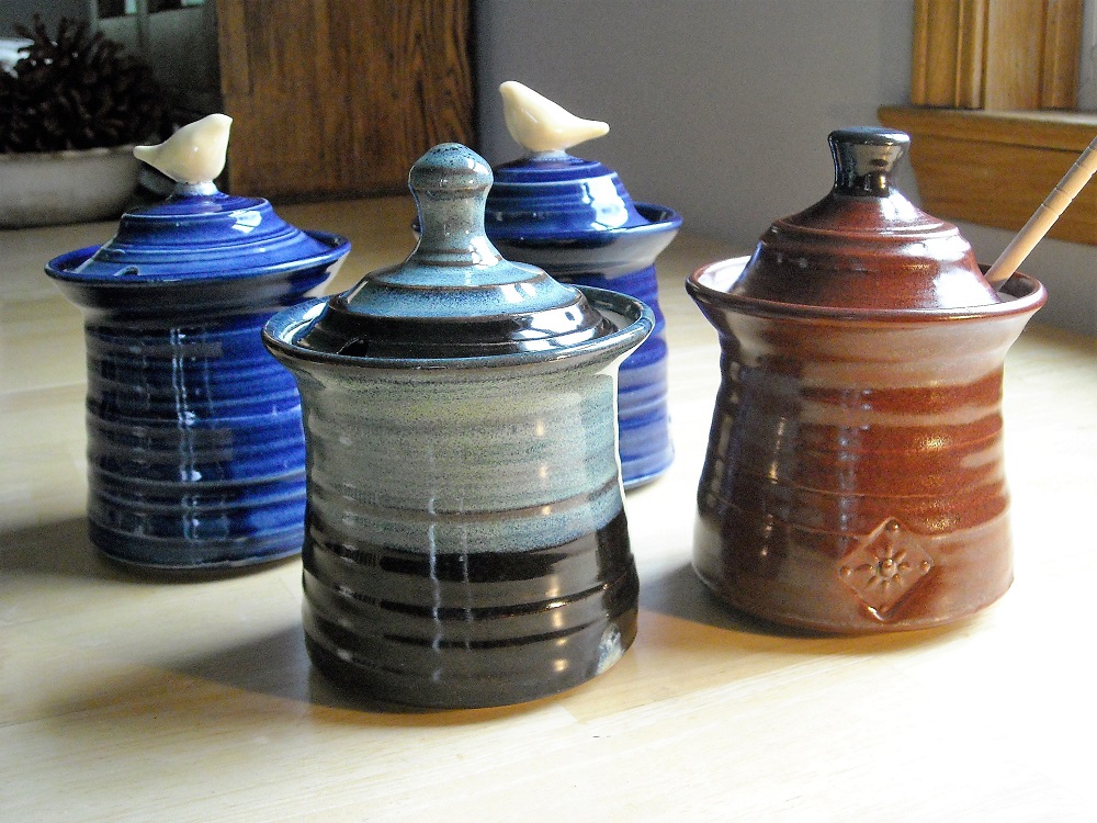
 The cobalt blue honey jars were made for a customer who requested that color.  At the time I had nothing with this glaze on it to show her. I said she was under no obligation to buy if it's not the color she expected. There is nothing personalized about the jars so I am perfectly fine with that.  I made two because those are two different clays and I wanted to see if the glaze worked better on one or the other.  Looks about the same to me.
A couple of other jars in robin's egg blue are getting decals fired on right now.

I like this glaze and once in a while I'll experiment to see how it behaves with other glazes. Thought I'd try the Blue Hare's fur dipped over top of the test tile.  Shiny brown with blue where it is thickest.  Promising. Not sure what this reddish glaze is really called as you will see if you check for the recipe here . Shiny brown with blue where thickest.  Promising.

Monday, March 6, 2017

keeping your own work, and Miss Billy is on the table

In the midst of a framing/hanging and wall painting project I decided to find a place to hang a couple of my recent clay tiles with found wood pieces. This is something I rarely do.  I may keep a mug or bowl that has a small imperfection but not the best stuff.  A new experience!  It's nice to have something of my own that normally I would automatically price to sell.

I had eight prints that needed framing, some of which have been sitting in a closet for years. Others were framed but needed fresh mats, and there was that one frame I made in 1982 out of stock molding for one of my wood cut prints.  It needed to go. So I ordered the mats, ordered some of the frames and got to it.  Oh, and painted the fireplace wall charcoal gray. It ended up that I hung twenty pieces since I had to shuffle around most of the other artwork.
 
 The eagle scout badge on the lamp belonged to my dad.  The lamp was used at one time as a coffee grinder by my mother's family.  I find it somewhat humorous that my son now uses one of these for grinding his coffee.  I didn't know they were still being made.

On the left is one of the found wood/clay tile pieces and a print by George Longfellow.  The drawing, with credit given to Grant Wood, was made for the Cincinnati Enquirer to go, I believe, with an article on robotics. You might have to look close to see that the man and woman have robot-like heads. The right picture shows a serigraphy print I made way back when.

 The wonderful print above is by Debbie Dicks.  This picture, unfortunately, does not do it justice.  The photo to the left of it is of Ivin's grandparents, father and uncle on the boat which brought them to America.

Back to work.  I thought that framing/hanging/painting project would take three days but it ended up taking six, of course. 
Notice the chair- it can be adjusted for height, a Christmas present from Ivin.  I was sitting there to wax bisque ware bottoms.  So much more relaxing than standing!
The dark clay-mini butter churn shapes are prototypes for a local historical organization.  

And Miss Billy came to visit, hoping for an open container of water or glaze.  I think she has learned that the pot of iron oxide is not optimal for paw dipping.  I still have to make sure I cover the glazes when she's around.

Blog Archive